|
okay well i've got a couple of screenshots now
When the app starts this is the screen you are faced with :-)

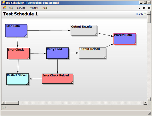
decided i wanted a nice blue background instead of the murky gray one - once you get round to making a schedule you can end up with screens like this

does it look confusing? hopefully not but at least you can see whats going on...
|